(01) Project Overview
Built for Industrial Performance
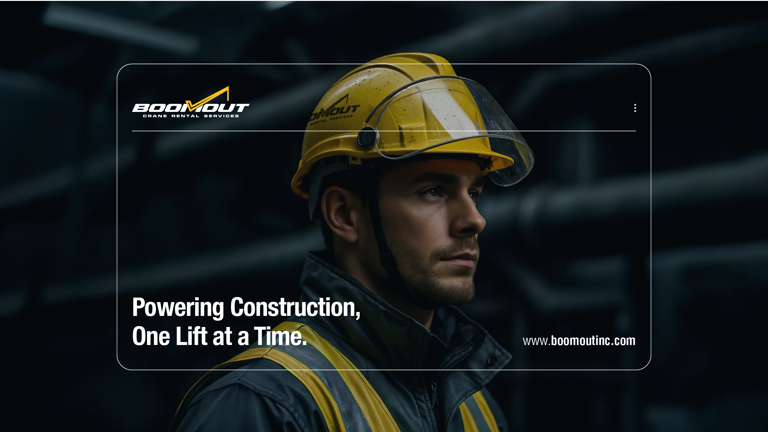
BoomOut Inc. is a fast-growing Canadian crane rental company specializing in boom truck and mobile crane services for commercial and industrial construction sites. As operations expanded across the Greater Toronto Area, the brand required a stronger visual identity and digital presence—one that reflected its engineering capabilities, safety standards, and professional execution. STORM Design Studio was engaged to elevate BoomOut from a purely functional brand into a confident, forward-facing industrial player.
Project Details
Client
BoomOut Inc.
Sector
Manufacturing & Industrial
Location
Toronto, Canada
Services
Branding, Brand Identity, Website Design & Development
Website


(02) The Challenge
Translating Capability Into Credibility
Despite strong on-site performance and operational reliability, BoomOut’s brand presence did not fully represent the scale or professionalism of its services. The existing identity lacked distinction, visual authority, and digital clarity—making it difficult to stand out in a competitive construction services market. The challenge was to create a brand system that communicated strength, trust, and efficiency while remaining practical for real-world, field-based applications.
WHAT WE DID
- • Stakeholder alignment
- • Brand positioning definition
- • Visual positioning analysis
- • Website structure and UX planning
(03) Storm 4D Method®
Engineered for Strength and Clarity
1/4 Discover
We analyzed BoomOut’s operational environment, service model, and customer expectations. This phase focused on understanding safety priorities, site realities, and how clients evaluate crane and lifting partners in high-risk, high-responsibility projects.
2/4 Define
The brand was anchored around reliability, precision, and industrial confidence. We defined a positioning that balances bold visibility with functional discipline—ensuring BoomOut communicates authority without unnecessary complexity.
3/4 Design
A strong visual identity was developed using structural geometry and motion-inspired forms. The black-and-yellow color system delivers instant recognition, high contrast, and practical usability across equipment, signage, and digital platforms.
4/4 Deliver
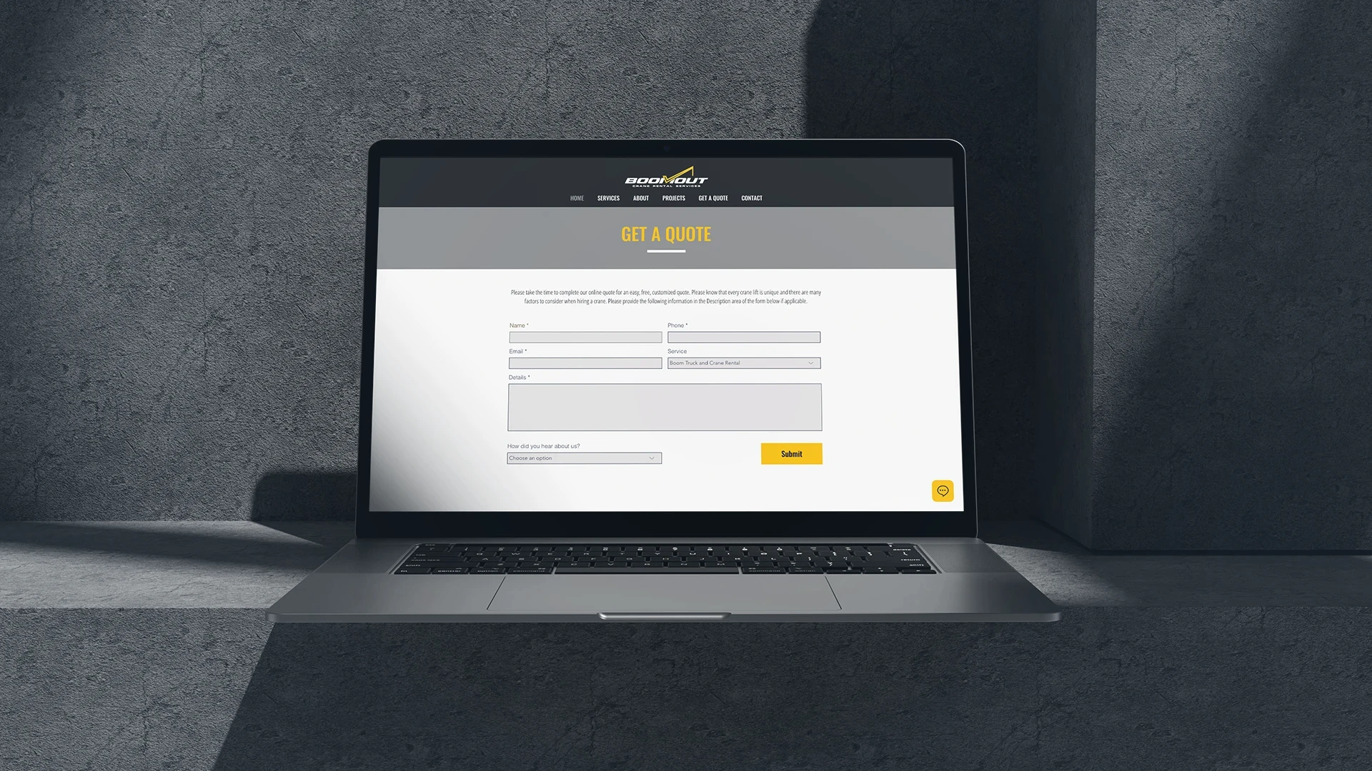
The identity was activated through a streamlined, mobile-optimized website designed for speed, clarity, and lead generation. Service pages, project documentation, and quote forms were structured to support fast decision-making and client confidence.
(04) Scope of Work
Brand Strategy / Brand Identity / Visual System / Website UX & UI Design / Website Design & Development / Digital Brand Application


(05) Client Testimonial
Trust STORM Design for all your marketing needs! Always great suggestions and ideas with many options. Quick and professional communication with high dedication and attention to detail in the products that they create. Thank you STORM!
— Larisa Venikova
Finance Director, Boom Out Inc
